Fading Pi Webdesign
When I was building the initial structure for my website, I wanted to create some
(ノ◕ヮ◕)ノ*:・゚✧
\(\pi\)'s calmly fading in and out with random scale and rotation.
HTML & CSS
The basic structure of the effect is simply a container
CSS
                        .pi-area {
                            position: relative;
                            overflow: hidden;
                        }

                        .shadow-pi {
                            /* other basic styling */
                            position: absolute;
                            animation: fadeInOut;
                            opacity: 0;
                        }

                        @keyframes fadeInOut {
                            40%, 80% { opacity: 0.25; }
                            100% { opacity: 0; }
                        }
Container, \(\pi\), and animation style.
One additional detail hidden within 'basic styling' above is that, depending on the
font you choose for the \(\pi\)'s some
JS & Math
The task of the code is to randomly spawn and later remove \(\pi\)'s while ensuring no overlap occurs. To achieve this, we can associate each \(\pi\) with a circle around its visual center. If we keep track of the position \((x_i,y_i)\) and the radius \(r_i\) of each circle \(S_i\) we can then easily check for overlap before spawning in a new \(\pi\).
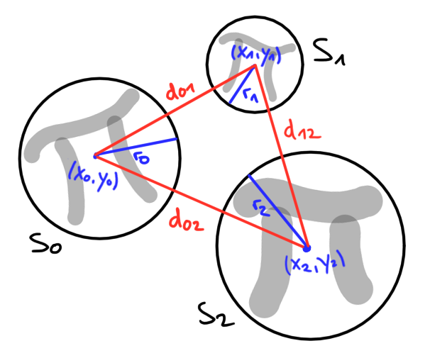
Compare red (distance) to blue (radius) lines to check for overlap.
The distance between the center points \((x_i,y_i)\) and \((x_j,y_j)\) of two circles
\(S_i\) and \(S_j\) is given by
\[d_{ij} := \sqrt{(x_i - x_j)^2 + (y_i - y_j)^2}\,.\]
The circles overlap if the sum of their radii \(r_i + r_j\) is greater than that
distance \(d_{ij}\). To check this in code, we utilize a two-dimensional array
JS
                        function isAreaTaken(midX0, midY0, rad0) {
                            for (const midX in takenArea) {
                                for (const midY in takenArea[midX]) {
                                    // do not compare a circle with itself
                                    if (midX == midX0 && midY == midY0) continue;

                                    // compares distance of midpoints to combined length of radii
                                    // if first is < then later for any area there is overlap
                                    const rad = takenArea[midX][midY];
                                    const diffMid = (midX - midX0) ** 2 + (midY - midY0) ** 2;
                                    const sumRad = (rad + rad0) ** 2;

                                    if (diffMid < sumRad) return true;
                                }
                            }

                            return false;
                        }
Checking each circle for possible overlap.
One small detail is that the code above actually compares \(d^2_{ij}\) to \((r_i+r_j)^2\), which is of course equivalent while avoiding the need to calculate square roots. Next, let's see how to give each \(\pi\) random characteristics. This is done by first pulling random values and then adjusting the corresponding CSS properties before spawning the \(\pi\) element.
JS
                        // pull random lifetime and convert to sec
                        let lifeTime = randomInRange(minLifeTime, maxLifeTime);
                        lifeTime = Math.round(lifeTime * 1000);

                        // lifetime = animation duration in CSS
                        shadowPi.style.animationDuration = `${lifeTime}ms`;

                        // remove element and free area after lifetime
                        shadowPi.onanimationend = () => {
                            shadowPi.remove();
                            freeArea(midX, midY);
                        };
Exemplary adjustment of a random lifetime.
In total, there are four properties assigned randomly to each \(\pi\): position, scale, rotation, and lifetime. Its position is bounded by the parent container, while the remaining properties are chosen within predefined min and max values. In addition the lifetime property is also tied to the proper removal of the \(\pi\) element itself and its associated circle, as described above.
JS
                        function spawnShadowPi(element) {
                            // instantiate the pi
                            const shadowPi = document.createElement('span');
                            shadowPi.classList.add('shadow-pi');
                            shadowPi.innerHTML = 'π';

                            // randomly pull values as described //
                            // set style based on random values above //
                            // make sure the pi can die properly //

                            const piWidth = 13.52 * scale;
                            const piHeight = 13.44 * scale;

                            // midpoint + radius of area to be taken
                            const midX = posX + piWidth / 2;
                            const midY = posY + piHeight / 2;
                            const rad = (piWidth / 2) * radius;

                            // only create pi if it still fits otherwise stop
                            if (isAreaTaken(midX, midY, rad)) return;
                            else takeArea(midX, midY, rad);

                            // finally add the pi to the element
                            element.appendChild(shadowPi);
                        }
Spawning function handling \(\pi\) creation, random property
assignment, \(\pi\) deletion, and checking for taken space.
assignment, \(\pi\) deletion, and checking for taken space.
Finally, to achieve a continuos effect, we have to instruct each container to
regularly attempt to spawn in new \(\pi\)'s. This can easily be done utilizing JS's
JS
                        document.querySelectorAll('.pi-area').forEach(el =>
                            setInterval(() => spawnShadowPi(el), spawnDelay))
Instructing each container to regularly spawn in \(\pi\)'s.